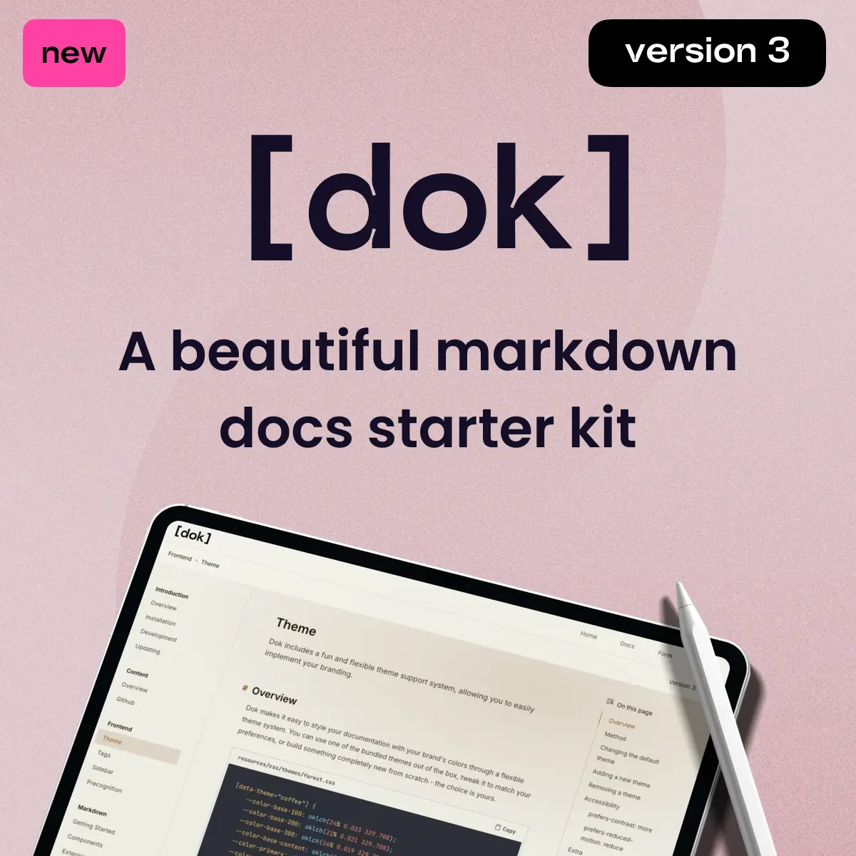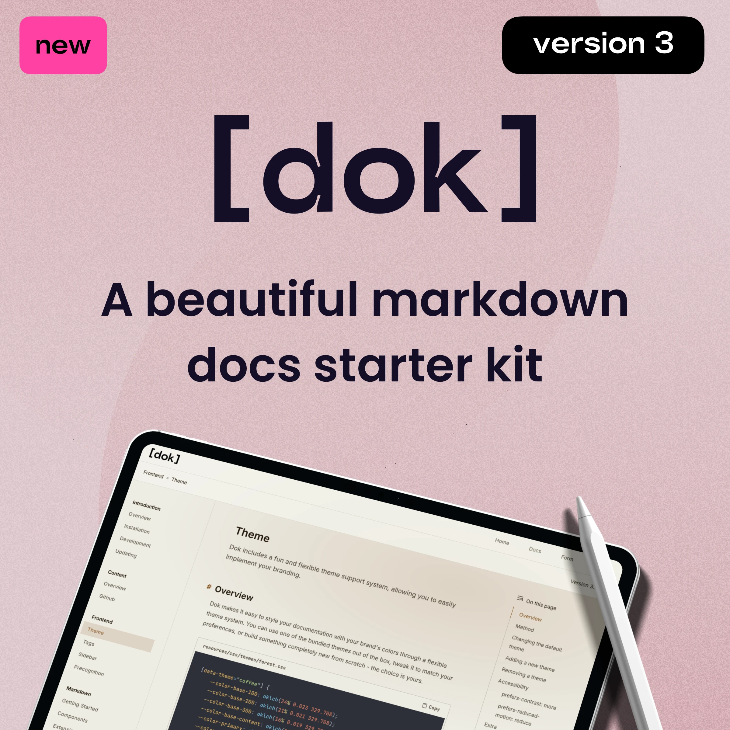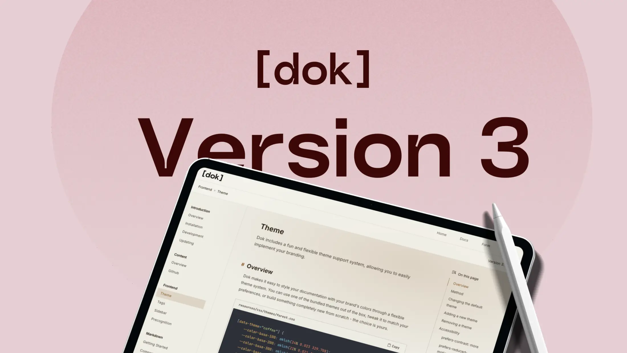
Dok Version 3 Released!
Posted on February 4th, 2026.
Sometimes it's good to take a break from a project for a while and actually use the thing you built. Over the holidays, I spent time properly working with Dok. Using it for real, extending beyond the documentation portion of the kit, looking for pain-points and scouting new features.
That process made a few things clear. Version 2 had some real friction: setting up new projects and releases was hard, tags lacked clarity and documentation, extension support was limited, theming was restrictive, and extending the system beyond documentation pages wasn’t practical. On top of that, there were a number of rough edges that added unnecessary complexity.
So I decided to take a step back and do a full rewire of all systems to make Dok more robust, more extensible, and actually fun to use. Below are 6 of, what I think, are the biggest and most exciting changes made to Dok!
In previous versions, we used variables to style specific areas of the site, like --color-sidebar-text. As you can imagine, this quickly gets out of hand. Especially if you want to add new features or pages.
Now, Dok uses semantic variables like base and primary. You could always add more in the future, like secondary, neutral. This gives you an absolute and centrally controlled theme system that effortlessly scales with your site.
Since the primary colour system consists of just 6 CSS variables, it was now feasible to include 7 pre-made themes right into the package!
--color-base-100: oklch(23.555% 0.01194 270.878);
--color-base-200: oklch(0.2025 0.0099 285.48);
--color-base-300: oklch(0.1947 0.0101 294.62);
--color-base-content: oklch(0.9432 0.0174 159.11);
--color-primary: oklch(0.8317 0.1682 153.91);
--color-primary-content: oklch(0.2735 0.0193 148.1);
With a new feature called Component Binding, you can create new blocks to use in your document, without ever having to create a new CommonMark extension (which isn't all that fun). The best part? They are bound to a Blade template, giving you complete control over your markup. They even support props, and slots.
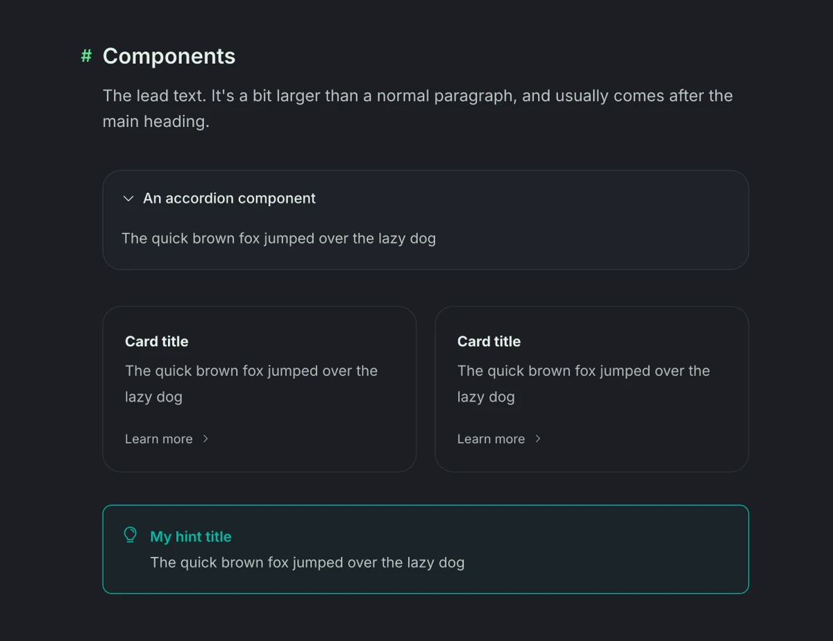
All of these come bundled with Dok.
Creating a new component is easy. Click on each tab to see how little code you need to generate a new component!
'components' => [
    'banner' => [
        'template' => 'components.banner.banner',
    ],
]
The new commands in version 3 make it much easier to create new projects and releases. I'm surprised it took this long, really.
This lets you skip all of the admin work like creating the collections, updating collection settings, adding navigations, and placing your release right under your project. You can even choose a route, configurable through the dok.php file.
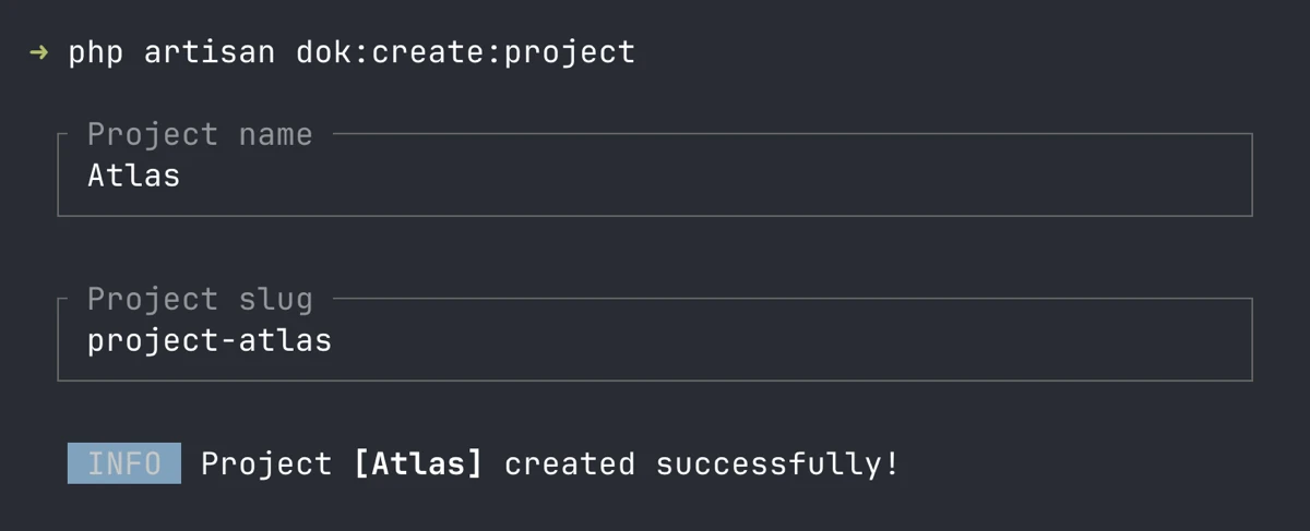
The new dok:create:project command!
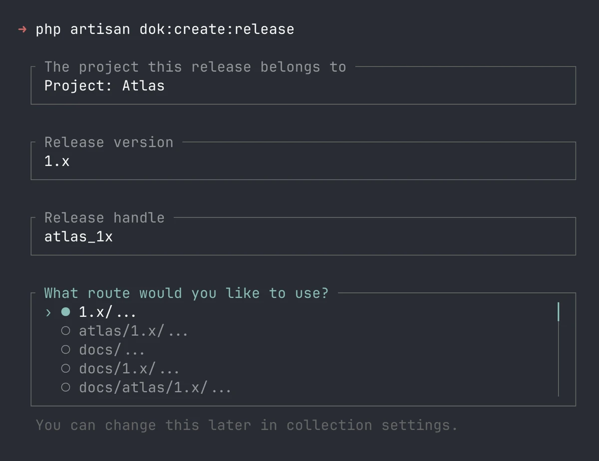
The new dok:create:release command!
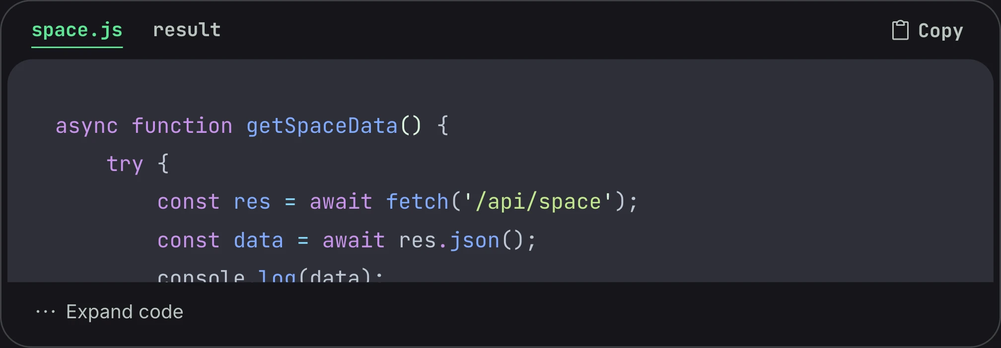
This new extension gives your fenced code blocks some much-needed love. You can now augment them with titles, tabs, and expandable sections.
The Code Group extension at work!
Yup, that thing we should have had way, way sooner is now in Version 3. Exposed through the dok:outline tag.
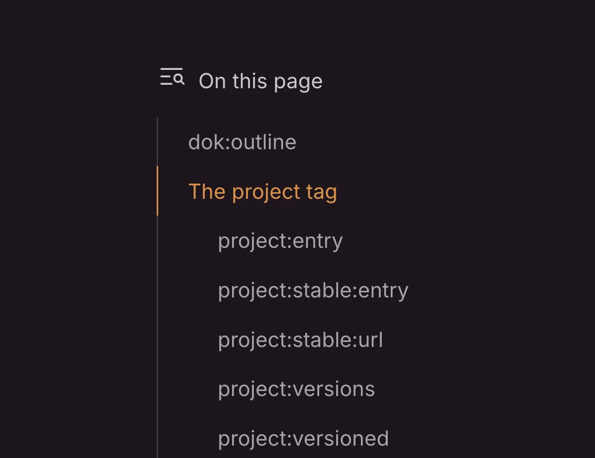
Why didnt we have this sooner?!?!
As part of making Dok more extensible and future-proof, UI styles have been incorporated into the starter kit. These are small CSS files that contain styles for a single UI component, like an input, button, or toggle.
Now, to style an input, all you need is to add an .input class!
The full list: Accordion, Button, Headings, Input, Label, Radio, Select, Textarea, Toggle.
Project and release tags have been rewritten from the ground up for a cleaner syntax. Plus, they're now fully documented!
Dok has been updated to support Statamic 6.
The typography system (`.prose`, similar to Tailwind Typography) has been completely rewritten from the ground up to be simpler.
All JavaScript (and Alpine components) code now lives in resources/js
Better support for prefers-contrast: more
Better support for prefers-reduced-motion: reduce
All phosphor icons now come bundled
Added Laravel Precognition. Alpine and form templates all included.
Images are now supported as project logos.
HTML/text is now supported as project logos.
Added TabelWrap markdown extension to wrap tables in additional HTML for styling purposes
Added HeadingWrap markdown extension to wrap inner heading content for better style and logic flexibility
Synced content is now on the entry level, instead of the collection
Plus some more, but this list is getting too long!
Here's what we've made so far. The list is always growing!